Research Initial Survey (Functional website)
Research | Design | Prototype | Develop
GOAL
The goal of this assignment from the Treehouse.com UX Design Tech Degree
was to produce a prototype of a grocery
shopping app which addresses pain points to grocery shoppers and helps to combat these
pain points.
Initial research by interviewing participants is conducted in order to get
an idea of the majority of pain points that users face.
STAGE 1. RESEARCH PHASE
For the initial research phase, i decided to filter out particants who would not likely
use the app going by previous experience of whether or not they had used a smartphone or
ever done their grocery shopping online.
This way, i aim to have partipants
whom can give me their experienced pain points from both instore and online grocery
shopping. This first phase involved a mini survey that i posted amongst friends and
colleagues on social media groups, (#embedded Website survey pictured right)
After completing the initial survey. I scheduled a series of 10 minute interview times
with 6 very lovely willing partipants. These interviews were conducted via several channels
such as Zoom, messenger chat and via phonecalls. During these interviews, i gathered information
from particants relating to their pain points from previous grocery shopping experiences
and also good experiences from their chosen shopping app or store.
From this data, i made an infinity map to gather the most expressed pain points and gain
insight of how to start the next phase of design. (#Pictured below)
Figma Affinity Diagram (Interactive)
PAIN POINTS DISCOVERY
After completing the research phase and looking over the affinity diagram. I discovered
that participants and potential users to the grocery shopping app found the following
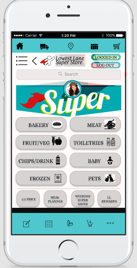
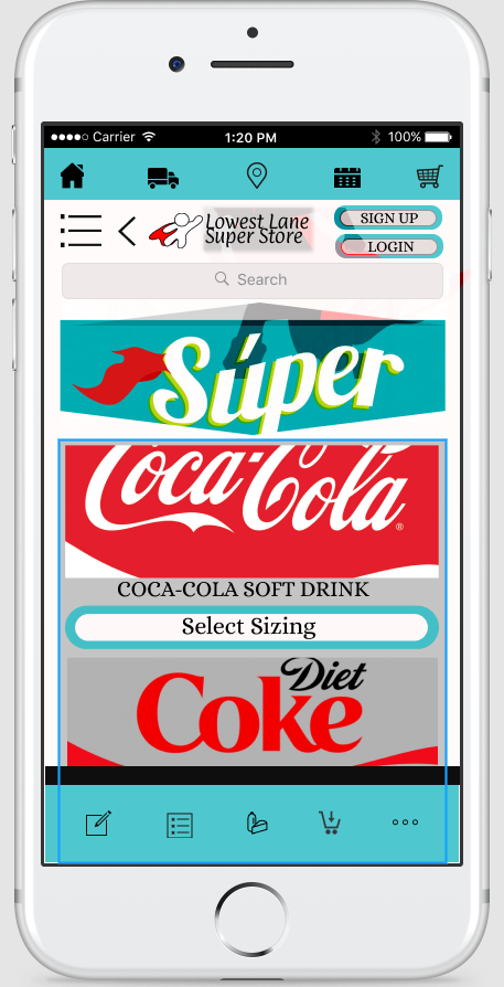
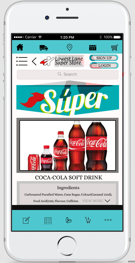
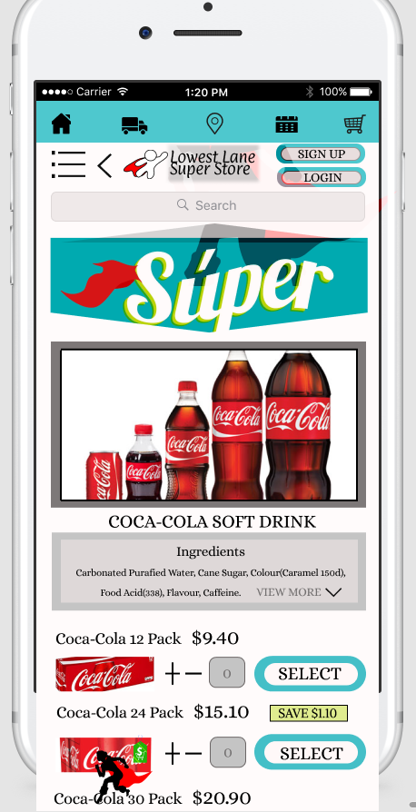
issues within their current grocery shopping experiences. Finding products is an issue.
Not only are product sizes of the same product not grouped together in most shopping apps
sizing of products against any type of chart is missing.
In bringing the product size variety to the same page, this knocks out two pain points.
It will show a difference in product size against one another and also stops the unnecessary
scrolling to find the correct size.
Meal pairing is also something that a couple of users wished that shopping apps contained.
Being able to find a meal that they want to cook and then have the items for that meal
provided within the same page to add to the shopping cart.
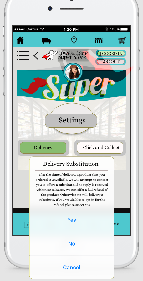
Delivery substitutes was an issue amongst participants. Creating a substitute messenger
feature within the app prior to delivery to confirm that customers are happy with their
substitutes picked out for them before they are delivered.
This could be designed so that there is a snapshot or list of items that were substituted
sent to the customer prior to delivery. Giving the customer a time limit to reply if they
are ok with it. The customer would know ahead of time that this snapshot will be sent if needed,
so they are still given the control of what is going to be the delivered end result.
I imagine this could bring in some time constraints to the store and may result in a new
problem if customers were to decline on the substituted product. To save that time
constraint, if customers decline the substitution, then a full refund of the item could
be a good way to finalise a decline result. Giving customers 30 mins to reply with their
decision could be an option also.
This would give the customer power over what their final delivered products would be,
taking away the pain point and frustration they feel of getting items that were not
previously consented to. Substitution is a nice feature that current grocery apps have,
but because Quality is so important to the users, the quality checking and final decision
should lay in the hands of the customer.
STAGE 2. DESIGN PHASE
The Design phase included drawing rough sketches of the grocery
app prototypes to get an idea of arrangement of the screen objects and to figure out where
and what needed to be included by using the user pain points as a reference.
STAGE 3. PROTOTYPE PHASE
The Prototype phase included firstly designing screen versions of the design on
which i chose to use design platform, 'Figma.com'. The screen designs are also connected together on this platform so that
designs can be interactive as seen right. (#Designs can also be zoomed in or out as well as scrolled)
I have included the individual screens below as screenshots. They are not interactive on this page,
but the next Stage of development lower on this article. I have embedded a fully functional
working coded prototype.
I have included the individual screens below as screenshots. They are not interactive on this page, but the next Stage of development lower on this article. I have embedded a fully functional working coded prototype.
Figma Screen Prototypes (Interactive)
Figma Scrollable Prototypes (Interactive)
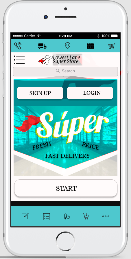
Home Screen
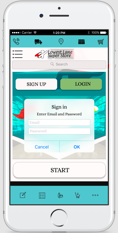
Login Screen
Sign Up Screen
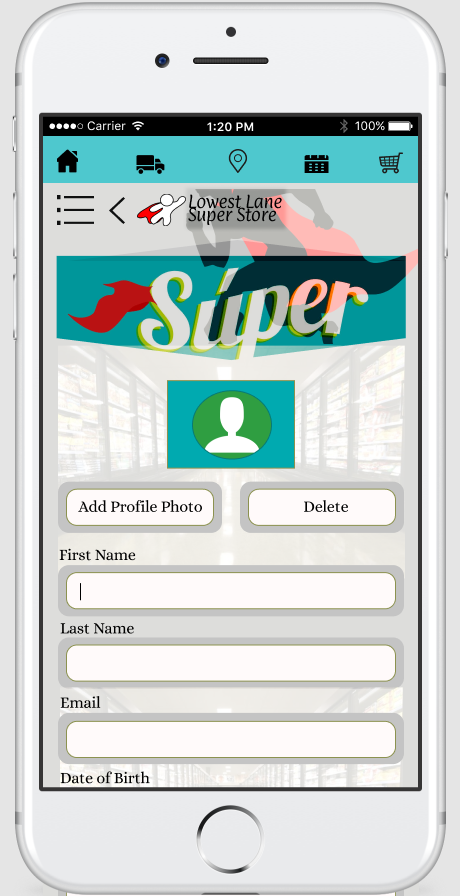
Settings Screen
Product Home Page Screen
Product Isle Screen
Product Detail Screen
Product Detail Scroll Screen
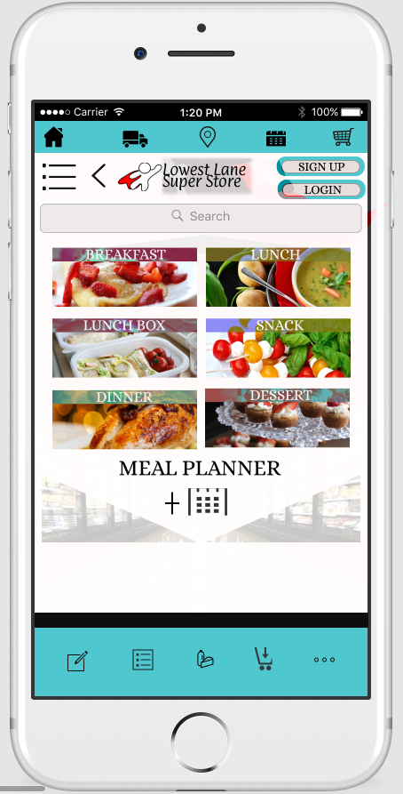
Meal Planner Screen
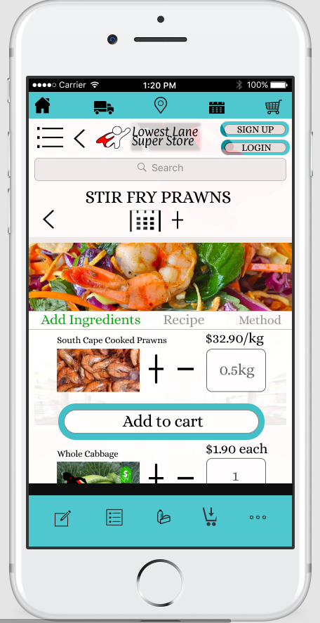
Recipe Screen